
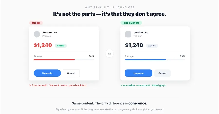
You've seen it. You ask an AI to build a dashboard, and it returns something that's… fine? Every component is individually competent. The button is a button. The card is a card. And yet the whole thing reads as generated — like a stock photo of a UI. For a long time I assumed the fix was "better components" or "more taste in the prompt." It isn't. After digging through the actual design literature — Refactoring UI, Material Design 3, Apple's HIG, IBM Carbon, WCAG, the Financial Times' visual voc
Why AI-Generated UIs Look 'Off' — and the One Principle That Fixes It
@kiwibreaksme